|
The Digiboxx kiosk will be the place
where customers can go to purchase, download, and manage
their music collection. A touch screen interface will
allow customers to interact with the kiosk and purchase
music.
Flow
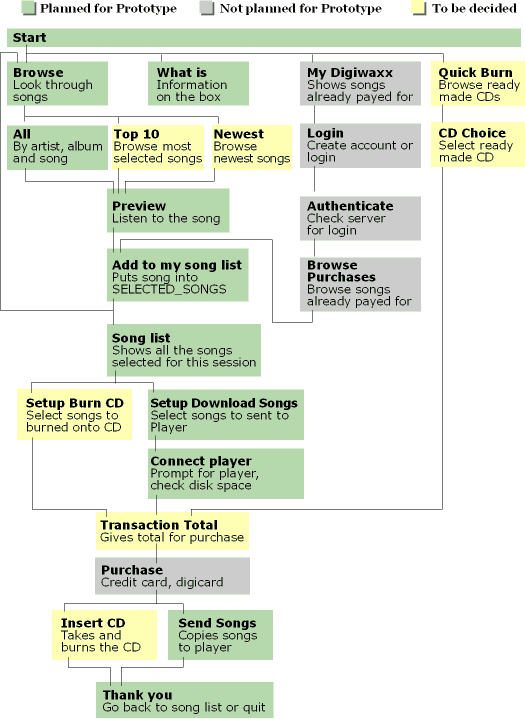
The customer's experience will be centered
around the choice of songs from several types of lists.
They can browse the whole library, popular or new songs,
or songs that they have already purchased. A look at the
possible choices given to a customer:

Storyboards
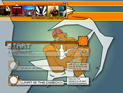
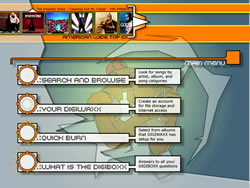
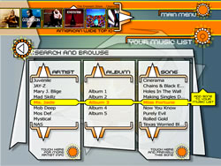
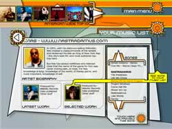
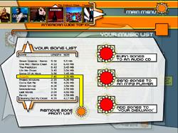
The interface was based on the imagery
in urban media and Digiwaxx's previous graphic design.
It uses the influences of bright colors, strong images
and gestural lines. Here are a few of the interface story
boards (click to see a larger version):
Implementation
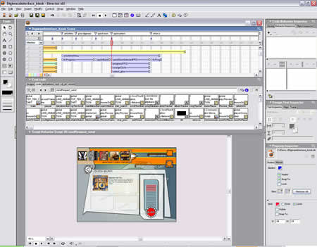
The interface for the prototype will
be implemented using Macromedia Director. This will allow
us to rapidly create a working and functional example
of the working kiosk.

Ambient
The interface for the prototype will
be implemented using Macromedia Director. This will allow
us to rapidly create a working and functional example
of the working kiosk.
Interface
(Take 2)
Above: A quick look at the new interface.
(Click Image)
Below: Here are some words that we feel will exemplify
the new interface.
- A matrix of information
- Game console interface meets flash
- Quick movements / transitions
- New age
- Unique
- Clean
- Sleek
Here are concepts for icons that would
go inside the cubes.
SearchAndBrowse.avi
(865 KB)
YourDigiwaxx.avi (958
KB)
QuickBurn.avi (923 KB)
WhatIsTheDigiboxx.avi
(1,020 KB)
Click
here for a sneak peek of the interface.
|
