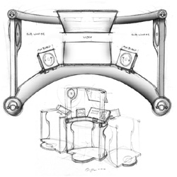
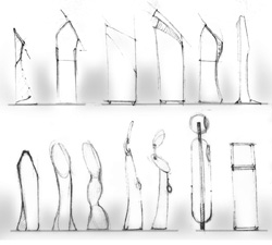
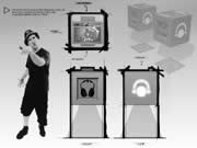
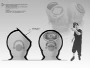
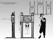
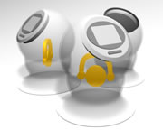
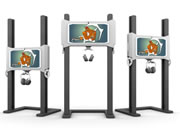
Top >| Collages>| Branding >| Initial Design >| Second Phase Designs >| Models The kiosk is based on a standard PC with a flat panel LCD monitor, slot loading CD burner, and a USB hub for MP3 players. For audio there is a head phone jack for the headphones, as well as a directional speaker. Below are concept sketches that has been done to create functionality and style to the above hardware, as well as potential secondary devices (click to see a larger version):
Top >| Collages>| Branding >| Initial Design >| Second Phase Designs >| Models Below are blueprints that we used to present 3 stylized concepts for the Digiboxx. The basis behind all of them is to design a form that is very simple and sculptural but still have a strong grasp on functionality. There are many different components that we had to implement into the kiosk designs (see above for more details) which was our biggest hurdle in this stage of development.
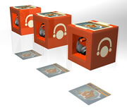
Top >| Collages>| Branding >| Initial Design >| Second Phase Designs >| Models Below are 3d models of each box concept. Click on each image to see a fly around movie.
Top >| Collages>| Branding >| Initial Design >| Second Phase Designs >| Models |
Updated Monday,
February 27, 2003
Email
us
