CONCEPT
ART/PAINTING DECISIONS
UPDATES
ART
AND THE CLIENT
The job of the concept artist and painter in Virpet Theater
was one that allowed freedom in the early stages of the creative
process, yet later was influenced greatly by the needs of our
client. In the early stages of the semester, we were free to
throw in any new and exciting ideas and figure out how to implement
these. But there was a reality where we had to step back and
look at what we could actually accomplish building this prototype
from scratch. The Children’s Museum was fantastic to work
with, open to suggestions, and full of useful advice regarding
the design, look and feel of the project. Our Client took special
interest in making Virpet Theater take advantage of the famous
local Pittsburgh collection of puppets, as opposed to there
other collections such as the Mr. Rogers or Jim Henson collections.
And I think it was a blessing in disguise to begin with these
puppets and as the system gets stronger and more advanced, begin
to involve the more famous puppets. Some of the puppets we originally
received, due to age and wear were in a state that made our
team wonder how the children would react to the if we were to
duplicate them digitally in their current state. However, we
found that once we made the digital replicas and placed them
into Lithtech, the puppets were less threatening then we had
originally feared. The kids for the most part found them funny
because of their strangeness. Also, the initial collection of
puppets we duplicated did not seem to flatter one another, because
there were so many various, unusual characters. But our team
did find that the digital puppets complimented each other quite
nicely once in the system and children respond positively to
the experience. This was due I believe to keeping our art sources
consistent. All puppets and environments were modeled and painted
by the same people.
VISUAL
CONSIDERATIONS
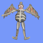
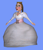
Our goal in making the digital replicas was to keep the puppets
as close to the originals as possible, while also sticking to
our time constraints and the amount of puppets the Children’s
Museum wanted to be built. While one model was being made, another
was being painted. We stuck to this switch off allowing us to
produce the puppets while focusing on quantity and quality.
The lighting situation currently in Lithtech 3.1 is poor. We
have to guess through trial and error where lights should be
placed and their brightness and colors. This was incredibly
time consuming – and we ended up with little positive
results. Therefore, we lighted everything reasonably brightly
and most of the texture maps include painted shadows and highlights.
We were able to complete 11 puppets this semester on top of
learning the ins and outs of the system and other jobs expected
from the team throughout the semester. This seemed to be a reasonable
amount for the size of our team. Any more would seem to have
overdone the team of three people – but any less would
have been falling short of what the Children’s Museum
needed for an exhibit this summer. We found that around ten
puppets keeps the children interested, and keeps them playing
with new versions of puppets and the whole experience.
In painting the models, most have been hand painted referencing
from photographs and the actual puppets. However, painting by
pasting directly from photos of the puppets saves time. The
Chinese model was finished using primarily photos and turned
out beautifully. However, painting the models from scratch seemed
to help with maintaining a common feel and helps the puppets
compliment one another. Painting the models from scratch was
done through Deep Paint exporting materials in Photoshop.
PAINTING
AND CHALLENGES
One major setback for the Virpets art team was that programs
often did not work properly and were quite buggy. The process
included making models in Maya or 3D Studio, painting them in
Deep Paint, sending the textures back to the 3D programs, opening
textures in Lithtech and saving as .trg and .dtx. Somewhere
along the lines (most consistently in Deep Paint) this would
breakdown, and information would not properly open in Lithtech.
Hopefully the new version will solve all these problems.
PROCESS
STAGE
CONCEPT ART
The stage was a difficult task to deal with because of style
and structure. The style needed to mesh well with the puppets
inhabiting the theater and also needed to reference to the time
when most of these puppets originated. This is why we decided
on an old time stage with arches and curtains. This was also
done because the stage needed to read as a stage as quickly
as possible. But the stage could not detract from the puppets
being the main event and focus of the whole experience. We tried
to paint different and changing background environments, but
the Children’s Museum said that this was not what they
were looking for. They were searching for a very subtle background
that complimented the stage and puppets. The art team felt that
different backgrounds would have helped the experience, but
went with the Museum’s request.
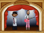
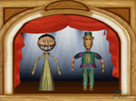
Making preliminary paintings in 2D were helpful to have for
artwork on the website, reference for the modelers and reference
for painting the models.
The structure of the stage was also a bit of a question because
this framed the whole experience. This frame we found could
cut too far into the experience and limit puppet movement. However,
pulling the stage too far outside of the view would detract
from the feeling of being on stage, and cause the aesthetics
of the whole experience to decline.
We allowed four or five days for each model to be built, and
three days for painting. This would have to be adjusted when
programs were not working properly or technical difficulties
were encountered.
HANDOFF
TO FUTURE DEVELOPERS
1.
ADD PUPPETS Make as many more puppets as possible…
2. MR. ROGERS PUPPETS If possible, get the
Mr. Rogers Collection created.
3. CURTAIN ANIMATION Animate a falling and
pulling curtain that starts and finishes with the music cues.
4. WALK AND DANCE Animate the characters when
they move around the space to walk or dance.
5. SIDE MOTIONS Give the characters subtle
yet interesting side motions that make them come alive. This
would be something that draws kids into the experience such
as the puppets blinking or including mouth movement. Maybe even
if the puppets started to act bored when kids are not playing
with them – this would cause the kids to feel more of
a connection with the puppets then them standing still.
6. UNIQUE MOVES Different puppets should have
their individual movement based off of the real motion of the
real puppet. Video a professional puppeteer playing with the
puppet and then see if you can imitate this.
7. PROPS The addition of props for the puppets
could be helpful
However, the children’s museum seems to want to stay as
close to portraying the real puppet as possible. Giving one
puppet characteristics or props which don’t necessarily
have to do with that puppet seems to be frowned upon.
8. UNIFIED DESIGN The designing of the final
exhibit should have an artistic “theme” which incorporates
all of the individual pieces of the project with one another.
By this I mean that the joystick controllers should have elements
that are similar to the projector screen. For example, if there
is a frame bordering the projector, this should match the style
of the design of the joysticks. Making the whole experience
compliment itself and feel like one whole complete exhibit is
important. So the website should match the interface and match
the joystick directions and the museum exhibit of the displayed
puppets. Right now there is no united design since this was
a prototype.
I also suggest that the stage is actually a flat painting in
the final exhibit, in which the puppets are projected onto.
This would save space and allow the puppets to move more freely.
